The SIR Model of Epidemics
For some reason, a lot of people have gotten really interested in epidemiology lately. Myself included.
I have no idea why.
Now, I’m not an epidemiologist. I don’t study infectious diseases. But I do know a little about how mathematical models work, so I wanted to explain how one of the common, simple epidemiological models works. This model isn’t anywhere near good enough to make concrete predictions about what’s going to happen. But it can give some basic intuition about how epidemics progress, and provide some context for what the experts are saying.
Disclaimer: I don’t study epidemics, and I don’t even study differential equation models like this one. I’m basically an interested amateur. I’m going to try my best not to make any predictions, or say anything specific about COVID-19. I don’t know what’s going to happen, and you shouldn’t listen to my guesses, or the guesses of anyone else who isn’t an actual epidemiologist.
The SIR Model
Parameters
The SIR model divides the population into three groups, which give the model its name:
- $S$ is the number of Susceptible people in the population. These are people who aren’t sick yet, but could get sick in the future.
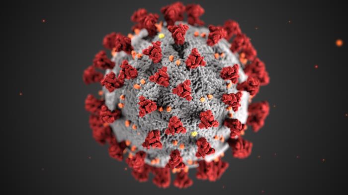
- $I$ is the number of Infected people. These are the people who are sick1 right now.
- $R$ is the number of people who have Recovered from the virus. They are immune and can’t get sick again.
- We also will use $N$ for the total number of people. So $N = S+ I + R$.

Not that kind of “sir”.
For the purposes of this model, we assume that the total number of people, $N$, doesn’t change. But the number of people in each $S,I,R$ group is changing all the time: susceptible people get infected, and infected people recover. So we write $S(t)$ for the number of susceptible people “at time $t$”—which is just a fancy way of saying that $S(3)$ means the number of susceptible people on the third day.
Change Over Time
In order to model how these groups evolve over time, we need to know how often those two changes happen. How quickly do sick people recover? And how quickly do susceptible people get sick?
The first question, in this model, is simple. Each infected person has a chance of recovering each day, which we call $\gamma$. So if the average person is sick for two weeks, we have $\gamma = \frac{1}{14}$. And on each day, $\gamma I$ sick people recover from the virus.
The second question is a little trickier. There are basically three things that determine how likely a susceptible person is to get sick: how many people they encounter in a day, what fraction of those people are sick, and how likely a sick person is to transmit the disease. The middle factor, the fraction of people who are sick, is $\frac{I}{N}$. We could think about the other two separately, but for mathematical convenience we group them together and call them $\beta$.
So the chance that a given susceptible person gets sick on each day is $\beta \frac{I}{N}$.2 And thus the total number of people who get sick each day is $\beta \frac{I}{N} S$.
If these letters look scary, it might help to realize that you’ve probably spent a lot of time lately thinking about $\beta$—although you probably didn’t call it that. The parameter $\beta$ measures how likely you are to get sick. You can decrease it by reducing the number of people you encounter in a day, through “social distancing” (or physical distancing). And you can decrease it by improved hygiene—better handwashing, not touching your face, and sterilizing common surfaces.
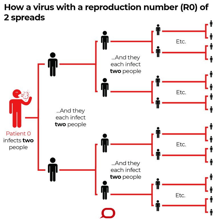
There’s one more number we can extract from this model, which you might have heard of. In a population with no resistance to the disease (so $S$ and $I$ are both small, and we can pretend that $S=N$), a sick person will infect $\beta$ people each day, and will be sick for $\frac{1}{\gamma}$ days, and so will infect a total of $\frac{\beta}{\gamma}$ people. We call this ratio is $R_0$; you may have seen in the news that the $R_0$ for COVID-19 is probably about $2.5$.
When $\beta$ is twice as big as $\gamma$, things can get bad very quickly. From The Conversation, licensed under CC BY-ND
Assumptions and Limitations
Like all models, this is a dramatic oversimplification of the real world. Simplifcation is good, because it means we can actually understand what the model says, and use that to improve our intuitions. But we do need to stay aware of some of the things we’re leaving out, and think about whether they matter.
First: the model assumes a static population: no one is born and no one dies. This is obviously wrong but it shouldn’t matter too much over the months-long timescale that we’re thinking about here. On the other hand, if you want to model years of disease progression, then you might need to include terms for new susceptible people being born, and for people from all three groups dying.
Second: the model assumes that recovery gives permanent immunity. Everyone who’s infected will eventually transition to recovered, and recovered people never lose their immunity and become susceptible again. I don’t think we know yet how many people develop immunity after getting COVID-19, or how long that immunity lasts.
But it seems basically reasonable to assume that most people will get immunity for at least several months; in this model we’re simplifying that to assume “all” of them do. And since we’re only trying to model the next several months, it doesn’t matter for our purposes whether immunity will last for one year or ten.
Third: we assumed that $\beta$ and $\gamma$ are constants, and not changing over time. But a lot of the response to the coronavirus has been designed to decrease $\beta$—and the extent of those changes may vary over time. People will be more or less careful as they get more or less worried, as the disease gets worse or better. And people might just get restless from staying home all the time and start being sloppier. An improved testing regime might also decrease $\beta$, and better treatments could improve $\gamma$.
But the model leaves $\beta$ and $\gamma$ the same at all times. So we can imagine it as describing what would happen if we didn’t change our lifestyle or do anything in response to the virus.
Finally: the first two factors, combined, mean that the susceptible population can only decrease, and the recovered population can only increase. Since we also hold $\beta$ and $\gamma$ constant, this model of the pandemic will only have one peak. It will never predict periodic or seasonal resurgences of infection, like we see with the flu.
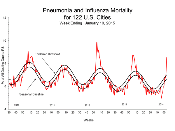
A graph of flu deaths per week, peaking each winter, from the CDC. The vanilla SIR model will never produce this sort of periodic seasonal pattern.
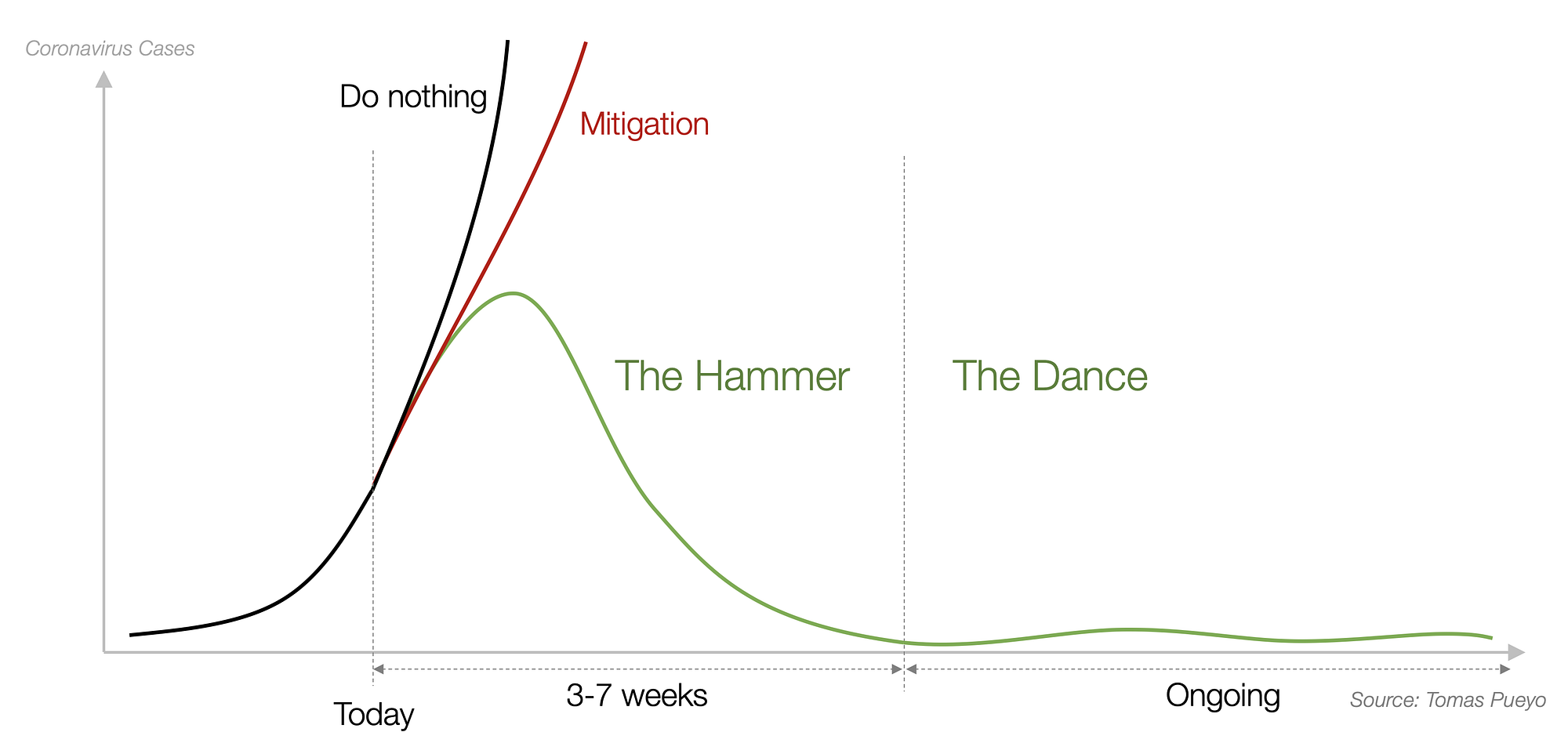
This green curve imagines a “dance” where we suppress coronavirus infections through an aggressive quarantine, and then spend months alternately relaxing the quarantine until infections get too high, and then tightening it again until infections fall back down. The SIR model doesn’t allow this sort of dynamic variation of $\beta$ and can never produce the green curve.
The Whole System
If we put all this together we get a system of ordinary nonlinear differential equations. A differential equation is an equation that talks about how quickly something changes; in these equations, we have the rates at which the number of susceptible, infected, and recovered people change. “Ordinary” means that there’s only one input variable; all the parameters change with time, but we’re not taking location as an input or anything. “Nonlinear” means that our equations aren’t in a specific “linear” form that’s really easy to work with.

Calling these equations a “nonlinear system” is a lot like calling this kitten a “nondog animal”. It’s not wrong, but it’s kind of weirdly specific if you’re not at a dog show.
If you took calculus, you might remember that we often write $\frac{dS}{dt}$ to mean the rate at which $S$ is changing over time. Roughly speaking, it’s the change in the total number of susceptible people over the course of a day. We know that $S$ is decreasing, since susceptible people get sick but we’re assuming that people don’t become susceptible, so $\frac{dS}{dt}$ is negative. And specifically, we worked out that $\frac{dS}{dt}$ is $-\beta \frac{IS}{N}$, since that’s the number of people who get sick each day.
Similarly, we saw that $\frac{dR}{dt}$ is $\gamma I$, the number of people who recover each day. And $\frac{dI}{dt}$ is the number of people who get sick minus the number who recover. All together this gives us:
\begin{align}
\frac{dS}{dt} & = - \beta \frac{IS}{N} \\\
\frac{dI}{dt} &= \beta \frac{IS}{N} - \gamma I \\\
\frac{dR}{dt} & = \gamma I
\end{align}
What Did We Learn?
Now that we have this model, what’s the point? We can actually do a few different things with a model like this. If we want, we can write down an exact formula that tells us how many people will be sick on each day. Unfortunately, the exact formula isn’t actually all that helpful. The paper I linked includes lovely equations like
\[z(\psi )= e^{-\mu\int_1^{\psi } \frac{ e^{\Psi (\xi )}}{\xi } \, d\xi } \left[\int_1^{\psi } e^{\Psi (\chi )+\mu\int_1^{\chi } \frac{ e^{\Psi (\xi )}}{\xi } \, d\xi } \, d\chi -\int_1^{\gamma N_2} e^{\Psi (\chi )+\mu\int_1^{\chi } \frac{ e^{\Psi (\xi )}}{\xi } \, d\xi } \, d\chi +N_3 e^{\mu\int_1^{\gamma N_2} \frac{ e^{\Psi (\xi )}}{\xi } \, d\xi }\right].\]And I don’t want to touch a formula that looks like that any more than you do.
Even if the formula were nicer, it wouldn’t be all that useful. Getting an exact solution to the equations doesn’t mean we know exactly how many people are going to get sick. Like all models, this one is a gross oversimplification of the real world. It’s not useful for making exact predictions; and if you want predictions that are kinda accurate, you should talk to the epidemiological experts, who have much more complicated models and much better data.
Qualitative Judgments
But this model does give us a qualitative sense of how epidemics progress. For instance, in the very early stages of the epidemic, almost everyone will be susceptible. So we can make a further simplifying assumption that $S = N, I = R =0$, and get the equation \(\frac{dI}{dt} = \beta I.\) This is famously the equation for exponential growth. And indeed, graphs of new coronavirus infections seem to start nearly perfectly exponential.
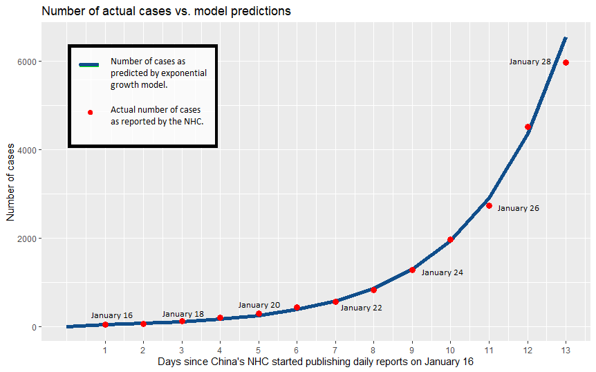
This graph from I24 news of reported infections in China almost perfectly matches the exponential curve.

This New York Times graph shows the exponential curves in both the US and Italy on the left. The right-hand logarithmic plots look nearly like straight lines, which which also reflects the exponential growth pattern.
As the epidemic progresses, the numbers of infected and recovered people climb. Each sick person will infect fewer additional people, since more of the people they meet are immune. We can see this in the model: the number of people who get infected each day is $\beta \frac{S}{N} I$. After many people have gotten sick, $\frac{S}{N}$ goes down and so fewer people get infected for a given value of $I$.
The epidemic will peak when people are recovering at least as fast as they get sick. This happens when $\beta \frac{IS}{N} \leq \gamma I$, and thus when $S = \frac{\gamma}{\beta} N$. Remember that $\frac{\beta}{\gamma}$ was our magic number $R_0$, so by the peak of the epidemic, only one person out of every $R_0$ people will have avoided getting sick.
If the estimates of $R_0 \approx 2.5$ are correct, this would mean that the epidemic would peak when something like 60% of the population had gotten sick. And remember, that’s not the end of the epidemic; that’s just the worst part. It would slowly get weaker from that time on, until it eventually fizzles.
(These are not predictions, for many reasons. I’m not an epidemiologist. Any real epidemiologist would be using a much more sophisticated model than this one to try to make real predictions. Don’t pay attention to the specific numbers I use here. But you can get a qualitative sense of what changing these numbers would do—and have more context for understanding what the real experts tell you.)
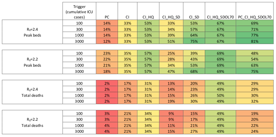
Predictions from actual experts use a ton of data and consider a huge range of possibilities, and generally look like this table from a team at Imperial College London.
Numeric Simulations
There’s one more thing that toy models like this can do. We can use them to run numeric simulations (using Euler’s method or something similar). We can see what would happen under our assumptions, and how the results change if we vary those assumptions.
Below is some code for the SIR model written in SageMath. (I borrowed the code from this page at Clemson; I believe the code was written by Jan Medlock.) I’ve primed it with $\gamma = .07$, which means that people are sick for two weeks on average, and $\beta = .2$, which gives us an $R_0$ of about $2.8$.
If you just click “Evaluate”, you’ll see what happens if we run this model using those values of $\beta$ and $\gamma$ over the next 400 days. It’s pretty grim; the epidemic peaks two months out with a sixth of the country sick at once (the red curve), and in six months well over 80% of the country has fallen ill at some point (the blue curve).3
But with this widget you can play with those assumptions. What happens if we find a way to cure people faster, so $\gamma$ goes down? What if we lower $\beta$, by physical distancing or improved hygiene? The graph improves dramatically. And you can change up all the numbers if you want to. Play around, and see what you learn.
And stay safe out there.
Have a question about the SIR model? Have other good resources on this to point people at? Or did you catch a mistake? Tweet me @ProfJayDaigle or leave a comment below.
And take care of yourself.
-
Or people who are asymptomatic carriers. This model doesn’t worry about who actually gets a fever and starts coughing, just who carries the virus and can maybe infect others. ↵Return to Post
-
If we’re being fancy, we say that the chance of getting sick is proportional to $\frac{I}{N}$ and that $\beta$ is the constant of proportionality. But if you’re not used to differential equations already I’m not sure that tells you very much. ↵Return to Post
-
Reminder: I don’t believe that this will happen, for many reasons. And you shouldn’t listen to me if I did. Numbers are for illustrative purposes only and should not be construed as epidemiological advice. ↵Return to Post
Tags: math teaching covid diffeq models explainer