Hypothesis Testing and its Discontents, Part 2: The Conquest of Decision Theory
This is the second-part of a three-part series on hypothesis testing.
In part 1 of this series, we looked at the historical origins of hypothesis testing, and described two different approaches to the idea: Fisher’s significance testing, and Neyman-Pearson hypothesis testing. In this essay, we’ll see how modern researchers use hypothesis testing in practice. And in part 3 we’ll talk about alternatives to hypothesis testing that can help us avoid replication crisis-type problems.
The modern method is an awkward mix of Fisher’s goals and Neyman and Pearson’s methods that attempts to provide a one-size-fits-all solution for scientific statistics. The inconsistencies within this approach are a major contributor to the replication crisis, making bad science both more likely and more visible.
Modern Hypothesis Testing
The two approaches to hypothesis testing we saw in part 1 were each designed to answer specific questions.
Fisher’s significance testing specifies a null hypothesis, and measures how much evidence our experiment provides against that null hypothesis. This is measured by the \(p\)-value, which tells us how likely our evidence would be if the null hypothesis is true. (It does not tell us how likely the null hypothesis is to be true!)
Neyman-Pearson hypothesis testing helps us make a decision between two courses of action, like prescribing a drug or not. We weigh the costs of getting it wrong in either direction, and decide which direction we want to default to if the evidence is unclear. The null hypothesis is that we should take that default action (such as not prescribing the drug), and the alternative is that we should take the other action (prescribing the drug).
Based on our weighing of the costs of making a mistake in either direction, and the amount of information we have to work with, we set a “false positive” threshold \(\alpha\) and a “false negative” threshold \(\beta\). These numbers are tricky to understand and describe correctly, even for experienced researchers. I encourage you to go read part 1 if you haven’t already, but in brief:
- The number \(\alpha\) measures the chance that, if the drug doesn’t work and isn’t worth taking, we will screw up and prescribe it anyway.
- The number \(\beta\) measures the chance that, if the drug works and is worth taking, we’ll make a mistake and withhold it.
The Neyman-Pearson method doesn’t try to tell us whether the drug “really works”; it only tells us how we should weigh the risks of making the two possible mistakes. Fisher’s method takes a very different approach and tries to measure the evidence to help us decide what to believe; but it does not give a clean yes-or-no answer.
Modern statistical hypothesis testing is a weird mishmash of these two approaches. We report \(p\)-values as evidence for or against the null hypothesis, as in Fisher-style significance testing. But we also try to give a yes-or-no, accept-or-reject verdict, as in the Neyman-Pearson approach. And while either approach can be useful on its own, the combination loses the key statistical benefits of each and leaves us in a bit of a muddle.
The modern approach in practice
Modern researchers generally do something like this:
- First we choose a significance level \(\alpha\). We usually default to \(\alpha = .05\), but we sometimes make it lower if we want to be really confident in our conclusions. Particle physicists often use an \(\alpha\) of about \(.0000003\), or about \(1\) in \(3.5\) million.1
-
Next we specify a null hypothesis, which is usually something like “the thing we’re studying has no effect”. We generally choose a null hypothesis that we don’t believe, because our machinery will attempt to disprove our null.
If we want to prove that a new drug helps prevent cancer, our null hypothesis will be that the drug has no effect on cancer rates. If we want to show that hiring practices are racially discriminatory, our null hypothesis will be that race has no effect on whether people get hired.
-
Technically, we also have an alternative hypothesis: “this drug does help prevent cancer”, or “hiring practices are affected by race”. This alternative hypothesis often what we actually believe, but we often don’t make it too precise during the design of the experiment. Specifying the alternative hypothesis well is a really important part of research design, but it’s a bit tangential to this essay so we won’t talk about it much here.
-
We run the experiment, do a Fisher-style significance test, and report the \(p\)-value we get. If it’s less than \(\alpha\), we reject the null hypothesis, and generally consider the experiment to have successfully proven our alternative is true. If the \(p\)-value is greater than \(\alpha\), we don’t reject the null hypothesis,2 and often view the experiment as a failure.
There are a few problems with this approach, but most of them stem from the same core issue: classical statistical tools are incredibly fragile. If you use them exactly as described, you are mathematically guaranteed to get some specific benefit. (In a correct Neyman-Pearson setup, for instance, you are guaranteed a false positive rate of size \(\alpha\). ) But you get exactly that guarantee, and possibly nothing more. My friend Nostalgebraist analogizes on Tumblr:
The classical toolbox also has a lot of oddities….The labels on the tools say things like “won’t melt below 300° F,” and you are in fact guaranteed that, but the same screwdriver might turn out to instantly vaporize when placed in water, or when held in the left hand. Whatever is not guaranteed on the label is possible, however dangerous or just plain dumb it may be.
This fragility means that if you carelessly combine two tools, you often lose the guarantees of each of them, and wind up with a screwdriver that melts at room temperature and also vaporizes when held in your left hand. And you may not get anything at all in return—other than, I suppose, the inherent benefits of being careless and lazy.

Sure, being lazy gets results. But they might not replicate.
The wrong tool for the job
The Neyman-Pearson method is designed to give an unambiguous yes-or-no answer to a question, so we can act on the information we currently have. This is exactly what we need when it’s time to make a specific decision about whether or not to open a new factory or change to a different brand of fertilizer. And the method was so successful that in 1955, John Tukey expressed concern about the “tendency of decision theory to attempt to conquest all of statistics”.
He worried because in scientific research we don’t want to make decisions, but reach conclusions. On the one hand, we don’t need to make a definitive decision right now. If it’s not clear which theory describes the evidence better, we can just say that, and wait for more evidence to come in. On the other hand, we want to eventually reach firm conclusions that we can trust, and use as a foundation for further work. That requires a higher degree of confidence than “the best we can say right now”, which is what Neyman-Pearson gives us. Fisher’s methods, in contrast, were designed to accumulate certainty through repeated consistent experimental results, the sort of thing a true conclusion theory would need.
But because Neyman-Pearson worked so well for a very specific type of problem (and probably also because Fisher was kind of terrible), many fields adopted it as a default and use it for pretty much everything. Daniel Lakens says that in hindsight, Tukey didn’t need to worry, since statistics textbooks for the social sciences don’t even discuss decision theory; but in fact we’ve largely adopted a tool of decision theory, and repurposed it to reach conclusions instead.
A decision theory needs to produce a clear, discrete answer to our questions, even if there’s not much evidence available. And unfortunately, our scientific papers regularly try to transmute weak evidence into strong conclusions. We tend to over-interpret individual studies, especially when one study is all we have. How often have you seen in the news that “a new study proves that” something is true? It’s almost never wise to conclude that a question is resolved because of one study. But the Neyman-Pearson framework is designed to do exactly that, and so inclines us to be overconfident.
Even if you have multiple studies, the same problem shows up in a different form. When there’s a complicated and messy body of research on a topic, we should probably hold complicated and messy beliefs, rather than forming a definitive conclusion. Instead, we often argue about which study is “right” and which is “wrong”, because that’s the lens we use to evaluate research.

My favorite article from The Onion demonstrates the wrong way to interpret conflicting studies.
Of course, sometimes one study is pretty much just wrong! If you have two studies and one shows that a child care program cuts poverty by 50% and the other shows that it increases poverty, at least one of them has to be pretty badly off the mark somehow. But even then, the hypothesis testing framework can mislead us, because of the way it handles the burden of proof.
Defaults Matter
Hypothesis testing methods build in a bias toward sticking with the null hypothesis. This is intentional; we’re looking for strong evidence that the null is false, not just something that might check out if we squint really hard. We want to put the burden of proof on showing that something new is actually happening.
But once a study rejects the null, it’s very easy to be decisive and treat its result as “proven”, and shift the burden of proof onto work that challenges the original study. So when a paper runs a hypothesis test and concludes that female-named hurricanes are more dangerous than male-named ones, this belief is “proven” and becomes the new default. And since that one study established a new baseline, anyone who disagrees now faces the burden of proof, and faces an uphill battle to convince people.
It’s pretty common for a small early study find a big effect, and then be followed up by a few larger and better studies that don’t find the same effect. But all too often people more or less conclude the big effect is real, because that first study found it, and the followups weren’t convincing enough to overcome the presumption that the effect is real.3
And the Neyman-Pearson framework reinforces this twice. First, because it is intentionally decisive, it encourages us to commit to the result of a single study. Second, rejecting the null hypothesis is seen as strong evidence against the null, but failing to reject is only weak evidence that the null is true. This is why we “fail to reject” rather than simply “accept” the null hypothesis: maybe the null is true, or maybe the experiment just wasn’t sensitive enough to reject it.
So if one study rejects the null and another fails to reject, it’s very easy to assume that the first study was just better. After all, it managed to reject the null, didn’t it? But a reasonable conclusion theory would incorporate both studies, rather than rejecting the one that “failed”.
Publication in practice
So far I’ve discussed theoretical problems with the hypothesis testing framework: reasons it might be the wrong tool for the problems we’re applying it to. But a possibly worse problem is that it’s very easy to misuse hypothesis testing, so that it doesn’t even do its own job correctly. And the structural dynamics of how research gets conducted, published, and distributed tends to encourage this misuse, and amplify the conclusions of sloppy studies.
Who wants to be boring?
Most academics really care about doing good research and contributing to our knowledge about the world; otherwise they wouldn’t be academics. The academic career path is long and grueling, and doesn’t pay very well compared to other things that nascent academics could be doing; there’s a reason people say that you shouldn’t get a Ph.D. if you can imagine being happy without one.
But that doesn’t mean research is conducted by cloistered ascetics with no motivations other than a monastic devotion to the truth. People who do research want to discover interesting things, not spend thirty years on experiments that don’t uncover anything new. Moreover, they want to discover things that other people think are interesting—people who can give them grants, or jobs, or maybe even book deals and TED talks.
Even without any dishonesty, this shapes the questions people ask, and also the way they answer them. First, people want to reject the null hypothesis, because we see that as strong evidence, but see failing to reject the null as weak evidence. An experiment that fails to reject the null is rarely actually published; all too often, it’s seen as an experiment that simply failed.
Second, people want to prove new and surprising things. It would be extremely easy for me to run a study rejecting the null hypothesis that 15-year-olds are on average about as tall as 5-year-olds. But no one would care about this study—including me—because we already know that.
Now, sometimes it’s worth clearly establishing that obvious things are in fact true. And we do have data on the average height of children at various ages, and it wouldn’t be hard to use that to show that 15-year-olds are taller than 5-year-olds. Collecting that sort of routine data on important topics is very useful and important work that we should probably reward more than we do.
But we don’t reward routine data collection heavily, and most of the time researchers are trying to prove surprising new results. And that’s exactly the problem: new results are “surprising” when you wouldn’t have expected them—which is exactly when they’re unlikely to be true.
“Why most published research findings are false”
This quest for surprising results interacts with the statistics of the Neyman-Pearson method in an extremely counterintuitive way. The statistical guarantee is: if we test a true null hypothesis, we’ll get a false rejection about five percent of the time. But that doesn’t mean a rejection has a five percent chance of being false. And the more studies of true null hypotheses we run, the bigger this difference gets.
We can most easily understand how this works with a couple examples. As a baseline, let’s look at the case where half our null hypotheses are true. Imagine we run two hundred studies, \(100\) with a true null hypothesis and \(100\) with a false null hypothesis. Our false positive rate is \(\alpha = 0.05\), so we’ll reject the null in five of the \(100\) studies where the null is true. And we generally hope for a false negative rate of \(\beta = 0.20\), in which case we reject the null in \(80\) of the \(100\) studies where the null is false.
| Null is false | Null is true | Total | |
|---|---|---|---|
| Reject the null | 80 | 5 | 85 |
| Don’t Reject | 20 | 95 | 115 |
| Total | 100 | 100 | 200 |
So we have \(85\) positive results, of which \(80\) are true positives and \(5\) are false positives, and so \(5/85 \approx 6\)% of our positive results are false positives.4 And that’s not too bad—the fact that it’s higher than the false positive rate of \(5\)% should be a warning sign.
But now imagine our researchers get more ambitious, and start testing more interesting and potentially-surprising findings. This means we should expect more of our null hypotheses to actually be true. If only ten percent of the original \(200\) null hypotheses are false, then we’ll have 180 studies with a true null and only 20 with a false null. We’ll still reject \(80\)% of false null hypotheses, and \(5\) of true null hypotheses, so our results look like this:
| Null is false | Null is true | Total | |
|---|---|---|---|
| Reject the null | 16 | 9 | 25 |
| Don’t Reject | 4 | 171 | 175 |
| Total | 20 | 180 | 200 |
Now we only have \(16\) true positives (out of \(20\) cases where we should reject), and we get \(9\) false positives (out of \(180\) cases where we shouldn’t reject the null). So a full \(9/25\) or \(36\)% of our positive results are false positives—much higher than \(5\)%! And often, only the studies that reject the null, and land in the first row of the table, get published at all. So we might find that a third of published papers will have false conclusions.
If researchers are regularly testing theories that are unlikely to be true, then most of the positive (and thus published) results can be false, even if the rate of false positives is quite low. This is the key observation of the famous paper by John Ioannidis that kicked off the replication crisis, Why Most Published Research Findings Are False.5
This is sometimes known as the file-drawer effect: we see the studies that get published, but not the “failed” ones that are left in the researchers’ filing cabinets. So even though only thirteen of the \(200\) studies give the wrong answer, \(9\) of the \(25\) that actually get published are wrong.
And no, \(9/25\) isn’t quite a majority, so while this is bad, it doesn’t seem to justify Ioannidis’s claim that “most” published findings are false.
But we haven’t talked about everything that can go wrong yet!
The problem of power
I said that “we generally hope for a false negative rate of \(\beta = 0.2\)”. But where does that hope come from?
The original Neyman-Pearson framework has two parameters, the false positive rate \(\alpha\) and the false negative rate \(\beta\). You can always make \(\alpha\) lower by accepting a higher \(\beta\), and researchers are supposed to balance these parameters against each other, based on the relative costs of making Type I and Type II errors. But in practice we just set \(\alpha\) to \(.05\) and move on with our lives; we don’t think about the relative balance of costs, or what it’s really saying about our research.
If our data is good enough, then we can make both \(\alpha\) and \(\beta\) are both small, and draw conclusions with a fair degree of confidence. But if our data is bad, then the study will be too weak to detect a lot of true effects, and so to keep \(\alpha\) small, we need to make \(\beta\) large. Consequently we say that the power of a study \(1 - \beta\), which is the true positive rate. A study with high power will usually give the correct answer; a study with low power can’t be trusted.

Much like we typically set \(\alpha = 0.05\), we typically try to get \(\beta \leq 0.2 \), and thus conduct studies with a power of at least \(80\)%. And like with the false positive rate, this number is also not really motivated by anything in particular: the choice is generally attributed to Jacob Cohen, who wrote that
The \(\beta\) of \(.20\) is chosen with the idea that… Type I errors are of the order of four times as serious as Type II errors. This \(.80\) desired power convention is offered with the hope that it will be ignored whenever an investigator can find a basis in his substantive concerns in his specific research investigation to choose a value ad hock.
That is, there’s no really good argument for not picking \(\beta = 0.1 \) or \(\beta = 0.3\) instead, but it seems like it’s about the right size if you don’t have any better ideas.
There are two problems here. The minor one is that both of these numbers are pretty arbitrary. If we have enough data that we can get \(\alpha = 0.05,\beta = 0.2\), then we could also choose to reject the null more readily and get something like \(\alpha = 0.1, \beta = 0.11\), with a high false positive rate but a power of \(89\)%; or we could be reject the null less often and get \(\alpha = 0.02, \beta = 0.33\), with a low false positive rate but power of only \(67\)%.
Which of those trade-offs we want depends the specifics of our current question: if Type I and Type II errors are about equally bad, we might want \(\alpha\) and \(\beta\) to be about the same size, but if a Type II error is much, much worse, we should want \(\alpha\) to be much smaller than \(\beta\). We can’t make an informed choice of \(\alpha\) and \(\beta\) without knowing details about the specific decision we’re trying to make.
But when we’re trying to do science it’s not clear what to choose. We can’t really quantify the costs of publishing a paper with a false conclusion; the entire setup of computing practical trade-offs doesn’t make all that much sense when we’re trying to discern the truth rather than make a decision. This is one major way that the Neyman-Perason framework isn’t the right tool for science: the entire method is premised on a calculation we can’t do.
But we can just set \(\alpha = 0.05, \beta = 0.20\), and see what happens. And as long as these numbers are a vaguely reasonable size, we’ll probably get vaguely reasonable results. We hope.
Where does power come from?
There’s a second problem, though, which is widespread and frequently disastrous. Sometimes \(\beta\) gets so large that a study becomes useless—and we don’t even notice.
For a given \(\alpha\), your \(\beta\) depends on the quality of the data you have. With very good data, you can be very confident about your conclusion in both directions. We have a tremendous amount of data about the relationship between age and height in children, so we can design studies that will have low rates of false positives and false negatives. And physics experiments ask for a false positive rate less than one in a million—and they can actually achieve this because their data is both copious and precise.
But with bad or noisy data, no amount of statistical cleverness can give any degree of confidence in our conclusions. If you want to study the effect on life expectancy of winning or losing an election to be a US state governor, you wind up with this scatterplot:
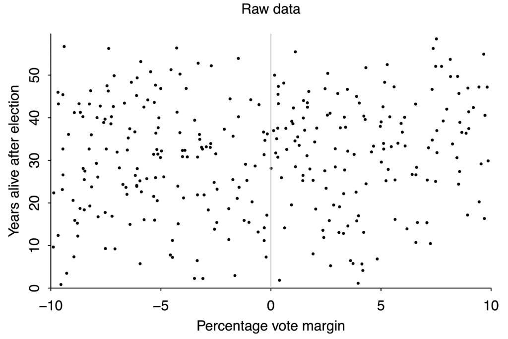 If your data is this scattered, you will never be able to detect small effects.
There aren’t that many governor races, and lifespan after any given race varies from just a couple years to more than fifty, so the data is extremely noisy. If winning an election boosted your lifespan by ten years, we would probably be able to tell. But an effect that large is absurd, and there’s no way to use data like this to pick up changes of just a year or two.
When we said we “ask for” a \(\beta\) below \(0.2\), we really meant “we should collect enough data to get a power of \(80\)%”. That’s not really an option for the governors study, without waiting around for more elections and more dead governors; on that question we’re kind of stuck with the data we have. Despite the Neyman-Pearson inclination to make a firm decision, all we can reasonably do is embrace uncertainty.
If we’re running a laboratory experiment, on the other hand, we can decide how big an effect we’re looking for, and calculate how many people we’d need to study to get a power of \(80\)%. But it’s hard to calculate this correctly, because it depends on how big the effect we’re studying is, and we don’t know how big it is because we haven’t done the study yet. So the calculation is based on a certain amount of guesswork.6
Even if we do this calculation correctly, there’s a real chance that we have to run a really big experiment to get the power we want. (If we’re looking for a small effect, we may have to run a really, really big experiment.) And big experiments are expensive! A lot of researchers skip this step entirely, and just run whatever experiment they can afford, regardless of how little power it has.
And if the power is low enough, things get very dumb very quickly.
We need more power!
Let’s start by looking at what happens when the power is really, idiotically low. This graph shows what happens when you run an experiment with a power of \(0.06\), which means a false negative rate of \(94\)%. And there are three different problems that pop up.
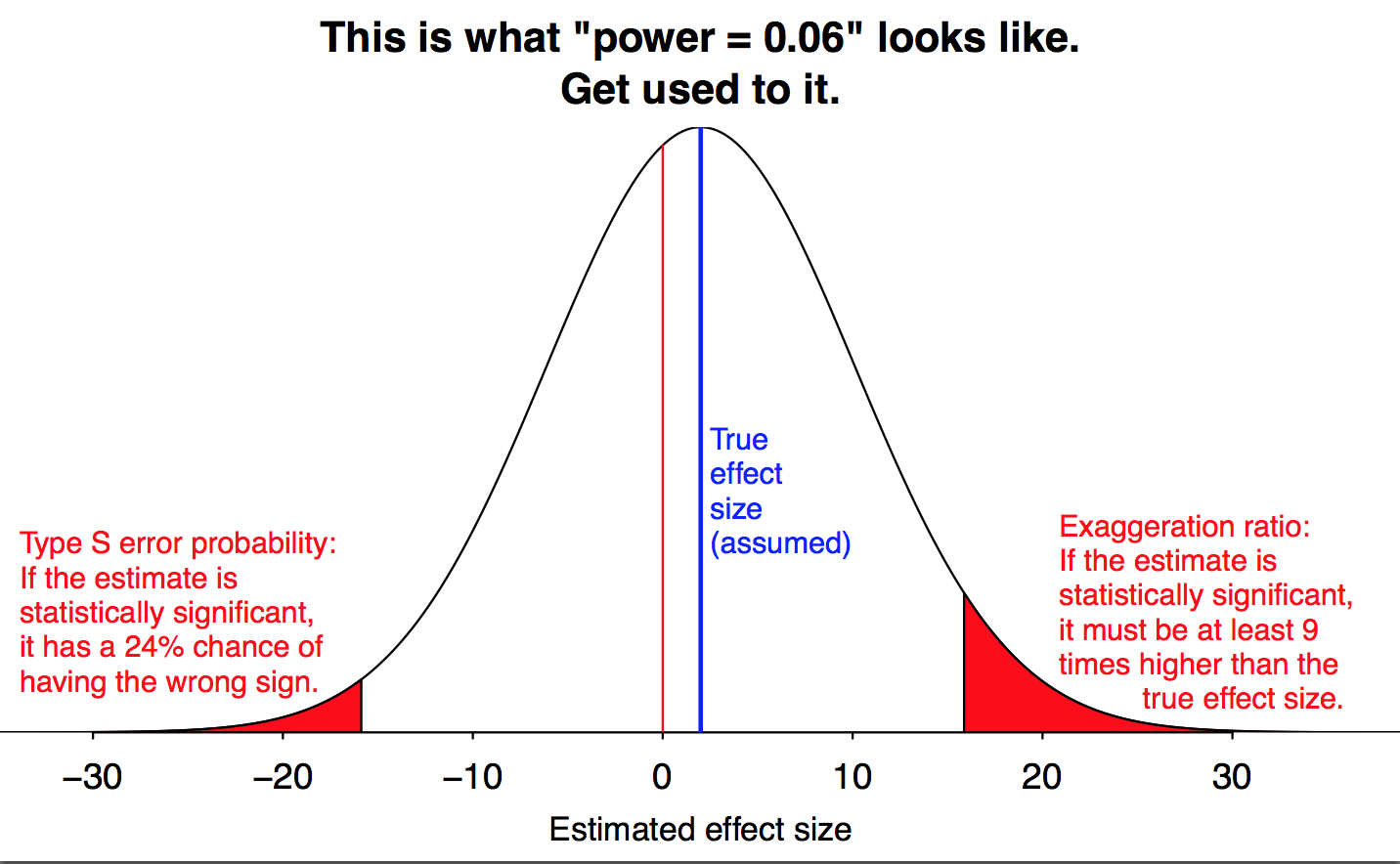
Figure by Andrew Gelman.
The obvious problem is that even if the null hypothesis is wrong, we probably won’t reject it, because the data isn’t good enough to show that it’s wrong. Even if the null is false, we’ll fail to reject it \(94\)% of the time! (This is represented by the large white area in the middle of the graph.) But this, at least, is the process working as intended: our goal was to err on the side of not rejecting the null hypothesis, and that is in fact what we’re doing.
But there are two subtler problems, which cause more trouble than just a pile of inconclusive studies. We still manage to reject the null \(6\)% of the time, but because the study is so weak, this only happens when we get unusually lucky. And that happens when our data is much, much further away from the null hypothesis than it usually is. At a power of \(\mathbf{0.06}\), we only get a significant result when our measurement is nine times as big as the true effect we want to measure. (This is the red region on the right of Gelman’s graph; he calls it a “Type M error”, for “magnitude”.)
This is a major culprit behind a lot of improbable ideas that come out of shoddy research. In my post on the replication crisis I talked about how a lot of careless research starts out asking whether an effect exists, but finds an effect that’s surprisingly large, and then the story people tell is focused on the dramatic, unexpectedly large effect. But that drama is a necessary result of running underpowered studies.
The study of gubernatorial elections and life expectancy is a perfect example of this process. Just by looking at the graph, you can tell there probably isn’t a big effect. But researchers Barfort, Klemmensen and Larsen found a clever analysis7 that did produce a statistically significant result—and claimed that the difference between narrowly winning and narrowly losing an election was ten years of lifespan. That’s far too large an effect to be believable, but any statistically significant result they got from that data set would have to be equally incredible.
Researchers are motivated to discover new and surprising things; and we, as news consumers, are most interested in new and surprising results. The wild overestimates that these low-power studies produce are surprising and counterintuitive, precisely because they are false. But they are surprising and counterintuitive, so they tend to draw public attention and show up in the news.
But a surprisingly large result isn’t as counterintuitive as one that’s the opposite of what you expect. (Imagine if a study “proved” that 5-year-olds are taller than 15-year-olds!) And low-power studies give us those results too.
Even if we’re studying something that really does (slightly) increase lifespan, we could get unusually unlucky, and randomly observe a bunch of people who die unusually early. If the data is noisy enough and we get unlucky enough, we can get statistically significant evidence that the effect decreases lifespan, when it really increases it.
We see this in the left tail of Gelman’s graph. When power is \(\mathbf{0.06}\), almost a quarter of statistically significant results will give you a large effect in the wrong direction. There’s a substantial chance that we get our result exactly backwards.
Now, a power of \(0.06\) is an extreme case, bad even by the usual standards of underpowered research. But the same problems come up with better-but-still-underpowered studies, just to a lesser degree. In fact, both effects are always possible, if your data is unlucky enough. But we’d much prefer having a \(0.1\)% chance of getting the direction of the effect wrong to having a \(24\)% chance. And the lower the power, the bigger an issue this is.
The revenge of the file drawer
There should be a saving grace here: if your study has low power, it’s unlikely to reject the null at all. We don’t have a \(24\)% chance of getting a statistically significant result in the wrong direction; because our power is only \(0.06\), we have a six percent chance of having a \(24\)% chance of getting a statistically significant result in the wrong direction. That’s less than two percent, in total.
But studies that don’t reject the null often don’t get published at all. There’s a good chance that the 94 studies that fail to reject the null get stuck in a file drawer somewhere; we’re left with a few studies that reject it, but wildly overestimate the effect, and one or two that reject the null in the wrong direction. When that’s all the information we have, it’s hard to figure out what’s really going on.
Let’s make another table of possible research findings, like the ones we used earlier to see how the file-drawer effect works. But this time, instead of assuming a reasonable power of \(80\)%, let’s see what happens when the power is only \(20\)%. If half the hypotheses are true and half are false, we get something like this:
| Null is false | Null is true | Total | |
|---|---|---|---|
| Reject the null | 20 | 5 | 25 |
| Don’t Reject | 80 | 95 | 175 |
| Total | 100 | 100 | 200 |
With \(80\)% power, our false-positive rate was \(6\)%. But with \(20\)% power, we have \(20\) true positives and \(5\) false positives, and our false-positive rate has risen \(5/25 = 20\)%.
And if we also suppose that are researchers are testing unlikely theories and so \(90\)% of null hypotheses are true, we get the following truly terrible table:
| Null is false | Null is true | Total | |
|---|---|---|---|
| Reject the null | 4 | 9 | 13 |
| Don’t Reject | 16 | 171 | 187 |
| Total | 20 | 180 | 200 |
Under these conditions we get \(9\) false positives and only \(4\) true positives, so almost \(70\)% of our positive results are false positives. If the only results we publish are these exciting positive results, then most published findings will, indeed, be false.
The problem of \(p\)-hacking and the garden of forking paths
It seems like we could fix this problem just by publishing null results as well. New norms like preregistration of studies and institutions like The Journal of Articles in Support of the Null Hypothesis try to combat the file drawer bias by publishing studies that don’t reject the null, or at least letting us know they happened so we can count them. If we publish just a quarter of null results, then even under the bad assumptions of the last table we get something like this:
| Null is false | Null is true | Total | |
|---|---|---|---|
| Reject the null | 4 | 9 | 13 |
| Don’t Reject, but Publish | 4 | 43 | 47 |
| Don’t Reject or Publish | 12 | 128 | 140 |
| Total | 20 | 180 | 200 |
We see \(60\) published results. The \(4\) results where the null is false and we reject it are correct, as are the \(43\) where the null is true and we don’t reject it, so over \(70\)% of the published results will be true. If we publish more null results, this number only gets better.
But that doesn’t address the fundamental problem, which is that researchers want to discover new, interesting things. The fact that we mostly publish positive results that reject the null isn’t some accident of history; it’s a result of people trying to show that their ideas are correct.
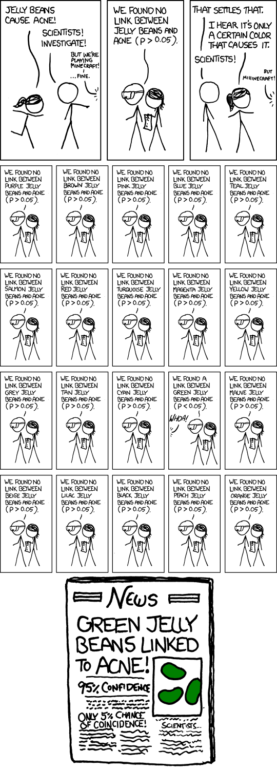
Since people want to reject the null hypothesis, they’ll work hard to find ways to do this. When done deliberately, this behavior is a form of research misconduct known as \(p\)-hacking or data dredging. There are a variety of sketchy ways to tweak your statistical analysis to get an artificially low \(p\)-value. The most famous version is just running a bunch of experiments and only reporting the ones with low \(p\)-values.
Somewhat less famous, and less obvious, is the possibility of running one experiment, and then trying to analyze that data in a bunch of different ways and picking the one that makes your position look the best. We actually saw an example of this in part 1 of this series, when I looked at my car’s gas mileage. I computed the \(p\)-value in two different ways, and got either \(0.0006\) or \(0.00004\). Either one of these is significant, but if they had been \(0.06\) and \(0.004\) instead, I could have just reported the second one and said “hey look, my data was significant!”
Moreover, it’s pretty common for people to look for secondary, “interaction” effects after looking for a main effect. Sure, watching a five-minute video didn’t have a statistically significant effect on depression in your study group. But maybe it worked on just the women? Or just the Asians? What if we control for income? You can check all the subgroups of your study, and whichever one reaches significance is obviously the interesting one.
 Sometimes your treatment really does have an effect on one specific subgroup. But it’s also an easy out when your main study didn’t reach significance.
This approach of doing multiple subgroup analyses, but only reporting one is still research misconduct, if done on purpose. But it’s possible to get the same effect without actually performing multiple analyses, in a process that Andrew Gelman and Eric Loken call the garden of forking paths.
Researchers often make decisions about how to test the data after looking at it for broad trends. If they notice one subgroup obviously sticking out, maybe they want to test it. Or they can tweak some minor parameters, decide to include or exclude outliers, and consider a few minor variations in the way they divide subjects into categories. This is all a reasonable way of looking at data, but it’s a violation of the rules of hypothesis testing, and has the same basic effect as running a bunch of experiments and only reporting the best one.
Most subtly, sometimes more than one pattern will provide support for the researcher’s hypothesis. We generally don’t actually care about specific statistical relationships; we care about broader questions, like “does media consumption affect rates of depression?”8 We run specific experiments in order to test these broad questions. And if there are, say, twenty different outcomes that would support our broad theoretical stance, it doesn’t help us very much that each one only has \(\mathbf{5}\)% odds of happening by chance.
Gelman and Loken describe how this applies to research by Daryl Bem, which claims to provide strong evidence for ESP.9
In his first experiment, in which 100 students participated in visualizations of images, he found a statistically significant result for erotic pictures but not for nonerotic pictures….
But consider all the other comparisons he could have drawn: If the subjects had identified all images at a rate statistically significantly higher than chance, that certainly would have been reported as evidence of ESP. Or what if performance had been higher for the nonerotic pictures? One could easily argue that the erotic images were distracting and only the nonerotic images were a good test of the phenomenon. If participants had performed statistically significantly better in the second half of the trial than in the first half, that would be evidence of learning; if better in the first half, evidence of fatigue.
Bem insists his hypothesis “was not formulated from a post hoc exploration of the data,” but a data-dependent analysis would not necessarily look “post hoc.” For example, if men had performed better with erotic images and women with romantic but nonerotic images, there is no reason such a pattern would look like fishing or p-hacking. Rather, it would be seen as a natural implication of the research hypothesis, because there is a considerable amount of literature suggesting sex differences in response to visual erotic stimuli. The problem resides in the one-to-many mapping from scientific to statistical hypotheses.
We even saw an example of forking paths earlier in this essay, in the study of gubernatorial lifespans. I said the study found a clever analysis to get a significant result. In the data set we saw from Barfort, Klemmensen, and Larsen, the obvious tests like linear regression don’t show any effect of winning margin on lifespan.
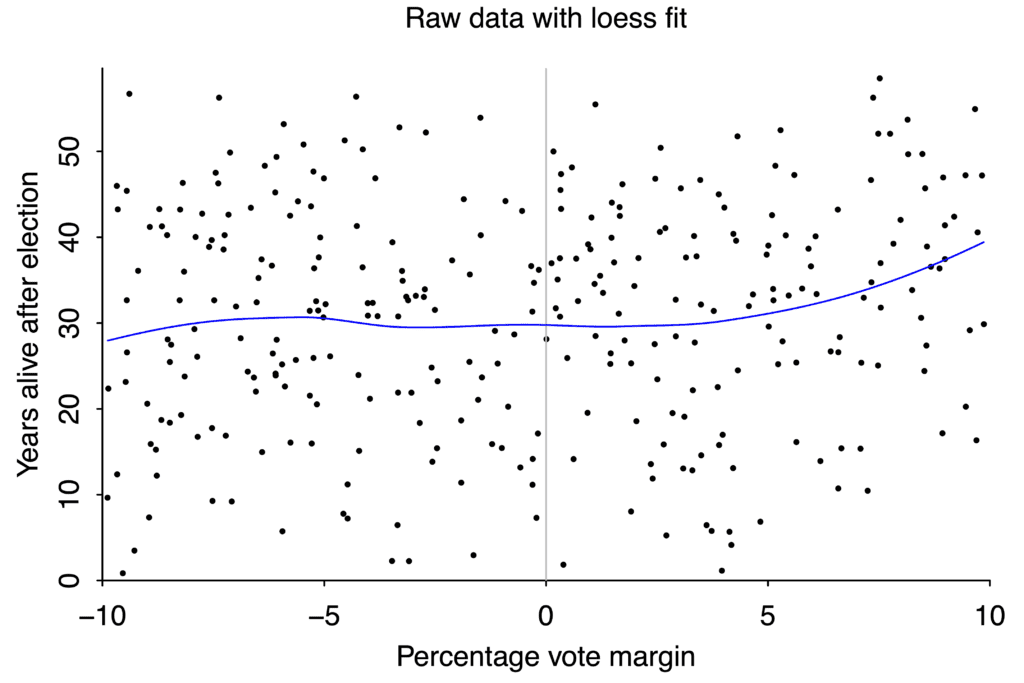 A loess curve is a more sophisticated version of linear regression. It doesn’t show a clear relationship between electoral margin and lifespan. Graph again by Andrew Gelman.
But if you average different candidates with the same electoral margin together, divide them into a group of winners and a group losers, and then do a regression on each group separately, the two regressions suggest that barely winning a race improves life expectancy, versus barely losing.
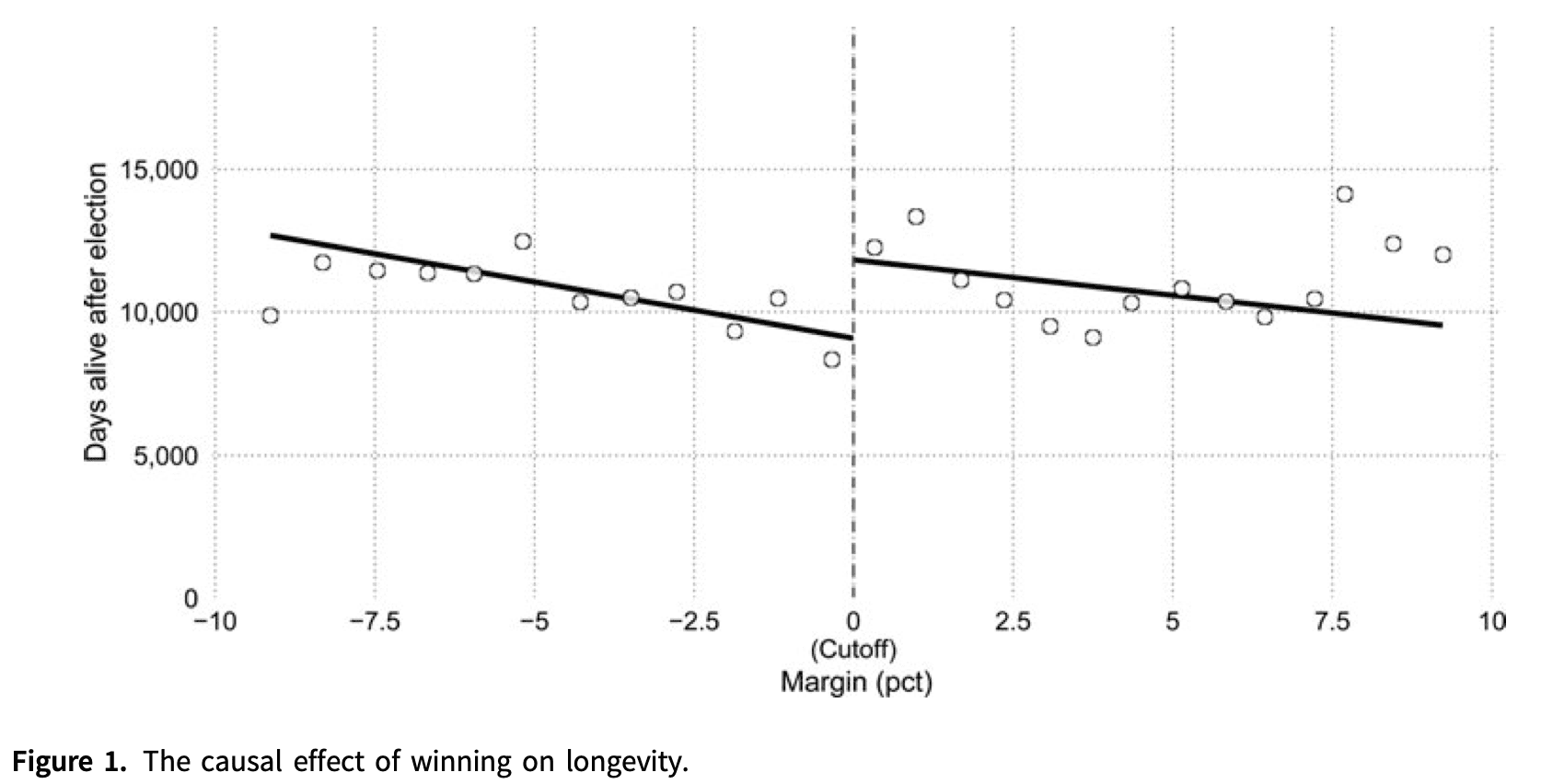
The discontinuity between the two lines is large enough to be “statistically significant”. But does the data on the right really look qualitatively different from the data on the left?
This regression continuity design isn’t a ridiculous approach to the question, but it’s also probably not the first idea you’d think of. And the paper’s own abstract says they’re not sure which way the effect should run, so any pattern at all would provide support for their research hypothesis. This is a subtle but crucial violation of the hypothesis testing framework, and dramatically inflates the rate of “positive” results.
So…why does science work at all?
Hopefully I’ve convinced you, first, that the tools of modern hypothesis testing are badly suited for the questions we want them to answer, and second, that the structure of our scientific institutions leads us to regularly misuse them in ways that make them even more misleading. So then, how do we manage to learn anything at all?
Sometimes we don’t! The whole point of the “replication crisis” is that we’re almost having to throw out entire fields wholesale. When I hear about a promising new drug, or a cool new social psychology study, I assume it’s bullshit, because so many of them are. And that’s a real crisis for whole idea of “scientific knowledge”.
But in many fields of study we do, in fact, manage to learn things. We know enough physics and chemistry to build things like spaceships and smartphones. And even though lot of drug studies are nonsense, modern medicine does in fact work.
We didn’t increase life expectancy by almost thirty years without learning something about biology.
And even in more vulnerable fields like psychology and sociology, we have developed a lot of consistent, replicable, useful knowledge. How did we get that to work, despite our shoddy statistics?
Inter-ocular trauma
If your data are good enough, you can get away with having crappy statistics. One of the best and most useful statistical tools is what Joe Berkson called the inter-ocular traumatic test: “you know what the data mean when the conclusion hits you between the eyes”.
I didn’t worry that this result was bullshit statistical trickery, because I can easily see the evidence for myself.
Conversely, if your data isn’t very good, statistics can’t help you with it very much. John Tukey famously wrote:
The data may not contain the answer. The combination of some data and an aching desire for an answer does not ensure that a reasonable answer can be extracted from a given body of data.
None of this means statistics is useless. But if we can consistently get good, high-quality data, we can afford a little sloppiness in our statistical methodology.
Putting the “replication” in “replication crisis”
And this is where the “replication” half of “replication crisis” comes in. If the signal you’re detecting is real, you can run another experiment, or do another study, and (probably) see the same thing. In my post on the replication crisis I wrote about how mathematicians are constantly replicating our important results, just by reading papers; and that protects us from a lot of the flaws plaguing social psychology.
Gelman recently made a similar point about fields like biology. Because wet lab biology is cumulative, people are continually replicating old work in the process of trying to do new work. A boring false result can survive for a long time, if no one cares enough to use it; an exciting false result will be exposed quickly when people try to build on it and it collapses under the strain.
This is something Fisher himself wrote about clearly and firmly: “A scientific fact should be regarded as experimentally established only if a properly designed experiment rarely fails to give this level of significance”. That is, we shouldn’t accept a result when we successfully do one experiment that produces a low \(p\)-value; but we should listen when we can consistently do experiments with low \(p\)-values.
But the entire concept of “replication” is in opposition to the artificial decisiveness of Neyman-Pearson hypothesis testing. The Neyman-Pearson method, if taken seriously, asks us to fully commit to believing a theory if our experiment comes up with \(p=0.049\); but that attitude is utterly terrible science. Good scientific practice needs to be able to hold beliefs lightly, revise them when new evidence comes in, and carefully build up solid foundations that can support further work.
The standard approach to hypothesis testing isn’t designed for that. Next time, in part 3, we’ll look at some tools that are.
Have questions about hypothesis testing? Is there something I didn’t cover, or even got completely wrong? Or is there something you’d like to hear more about in the rest of this series? Tweet me @ProfJayDaigle or leave a comment below.
-
This is the probability of getting data five standard deviations away from the mean. So you’ll often see this reported as a significance threshold of \(5 \sigma\). Related is the Six Sigma techniques for ensuring manufacturing quality, though somewhat counterintuitively they typically only aim for 4.5 \(\sigma\) of accuracy. ↵Return to Post
-
It is common for people to be sloppy here and say they “accept” the null. In fact, I wrote that in my first draft of this paragraph. But it’s bad practice to say that, because even a very high \(p\)-value doesn’t provide good evidence that the null hypothesis is true. Our methods are designed to default to the null hypothesis when teh data is ambiguous.
Neyman did use the phrase “accept the null”, but in the context of a decision process, where “accepting the null” means taking some specific, concrete action implied by the null, rather than more generally committing to believe something. ↵Return to Post
-
Andrew Gelman suggests a helpful time-reversal heuristic: what would you think if you saw the same studies in the opposite order? You’d start with a few large studies establishing no effect, followed by one smaller study showing an effect. In theory that gives you the exact same information, but in practice people would treat it very differently—assuming the first studies actually got published. ↵Return to Post
-
You might recognize this as an application of Bayes’s theorem, and a basic example of Bayesian inference. Tables like these are very common in Bayesian calculations. ↵Return to Post
-
Followups to Ioannidis’s paper contend that only about \(14\)% of published biomedical findings are actually false. I’m not in a position to comment on this one way or the other. In psychology, different studies estimate that somewhere between from \(36\)% and \(62\)% of published results replicate. ↵Return to Post
-
We can also base it on how big of an effect we care about. If we’re studying reaction times, we might decide that an effect smaller than ten milliseconds is irrelevant, and we don’t care about it even if it’s real. Then we can choose a study with enough power to detect a \(10\)ms effect at least \(80\)% of the time.
But this brings us back to the core issue, that “is there an effect” just isn’t a great question, and the Neyman-Pearson method isn’t a great tool for answering it. ↵Return to Post
-
Clever analyses like this are often a bad idea; we’ll come back to this idea soon. ↵Return to Post
-
This difference is the source of a lot of research pitfalls; if you want to dig into this more, I recommend Tal Yarkoni on generalizability, Vazire, Schiavone, and Bottesini on the four types of validity, and Scheel, Tiokhin, Isager, and Lakens on the derivation chain. ↵Return to Post
-
Scott Alexander has pointed out that ESP experiments are a great test case for our scientific and statistical methods, because we have extremely high confidence that we already know the true answer. ↵Return to Post
Tags: philosophy of math science replication crisis statistics